
Best AI Image Generators for B2B Marketers 2026 (tested with prompts and rated)
Most AI image generator roundups review features. This one reviews outputs. I typed the exact same prompts into 8 tools and compared what came out.
The idea is to test the same prompt, relevant for B2B. One generation each, no retries, all on free plans, because that is how most marketers first try these tools before asking for a subscription.
Here is the full test, the images, the scores, and the prompts you can reuse.
How I tested (methodology)
The rules:
- Same prompt, word for word, in every tool. No tool-specific tweaking.
- One generation per prompt per tool. The first result counts. No re-rolls.
- Free plans only. Watermarks, queues, and credit limits included.
- Scored on criteria that matter to B2B work, not artistic merit.
The three tests:
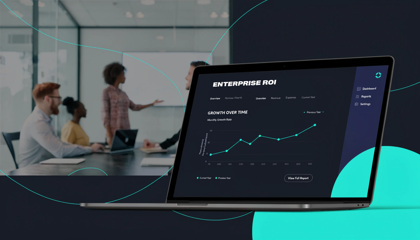
- Product mockup: Something B2B marketers often need for landing pages, ads, resources, and blog posts
- Image-to-image infographic: Now flowcharts are pretty common, most B2B sales teams draw those explanations and marketers are often asked to recreate these.
- The pigeon test: Because I want to try something absurd or non-realistic too to test prompt obedience.
Scoring: 5 criteria, 1 to 5 points each, 25 per test, 75 total.
The prompts I used
Test 1: Product mockup
Test 2: Image-to-image infographic (with a reference image uploaded)
Test 3: The pigeon
The overall scoreboard
Test 1: The product mockup
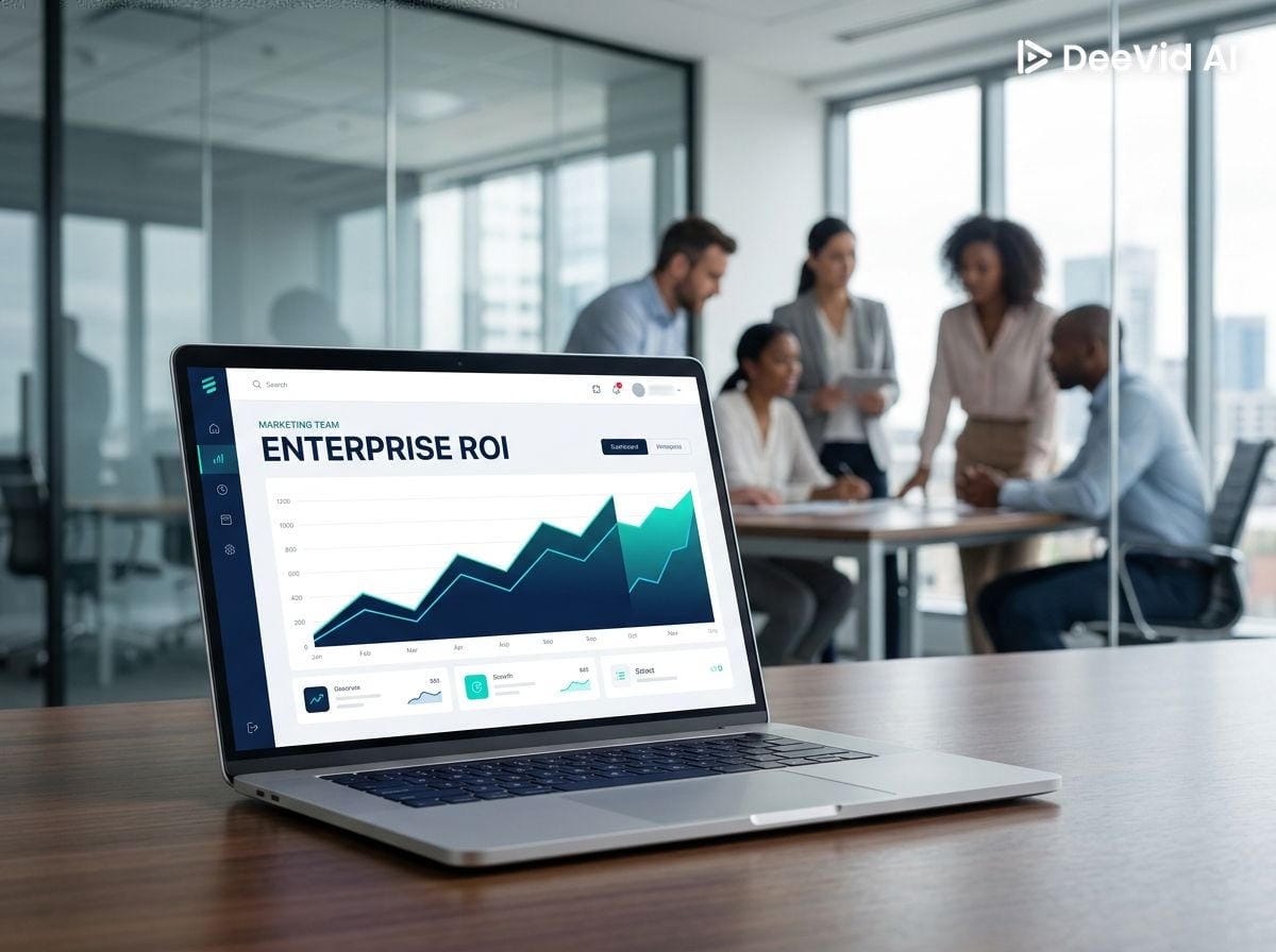
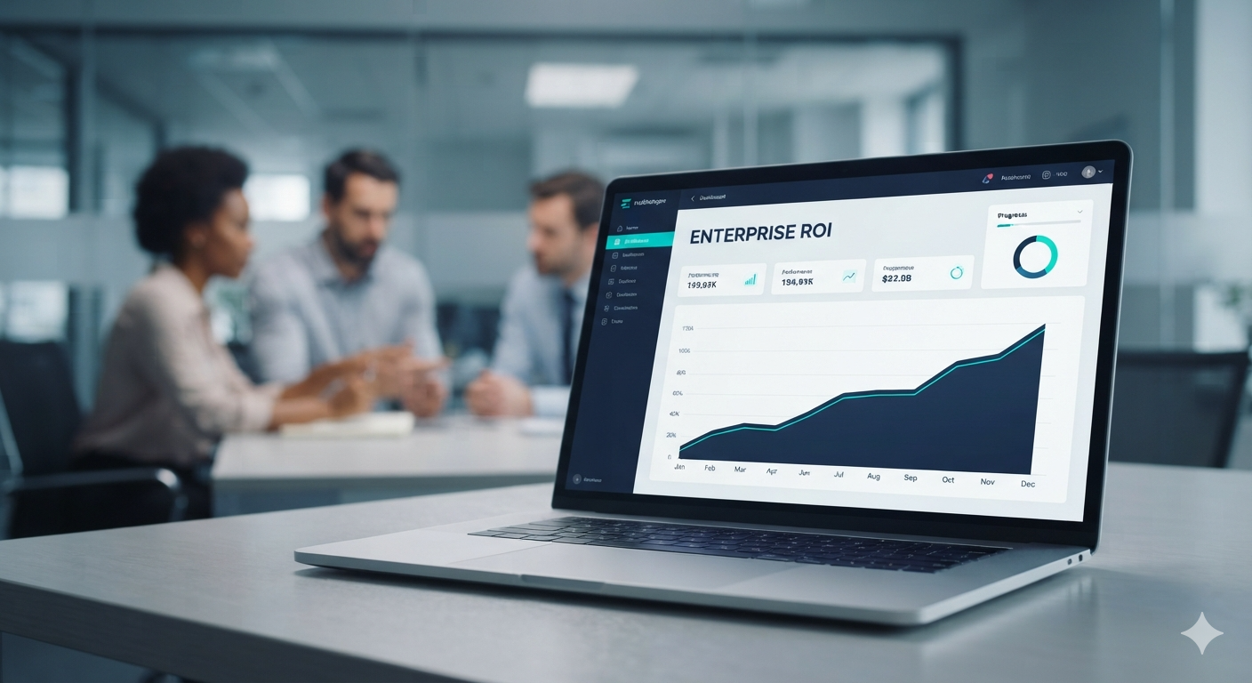
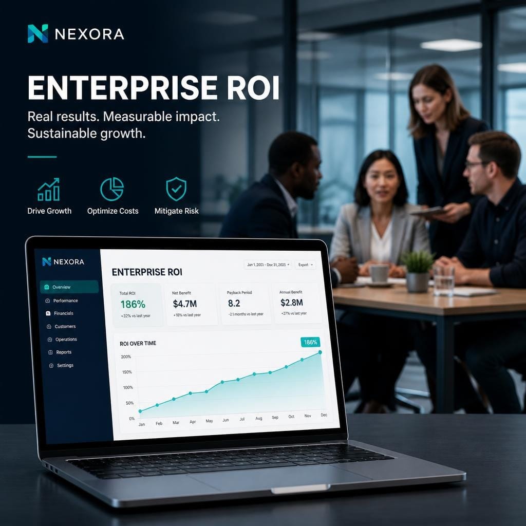
The trap in this prompt is the phrase "ENTERPRISE ROI". Text rendering inside images has been a weak point of these tools for years.





Test 2: Image-to-image infographic
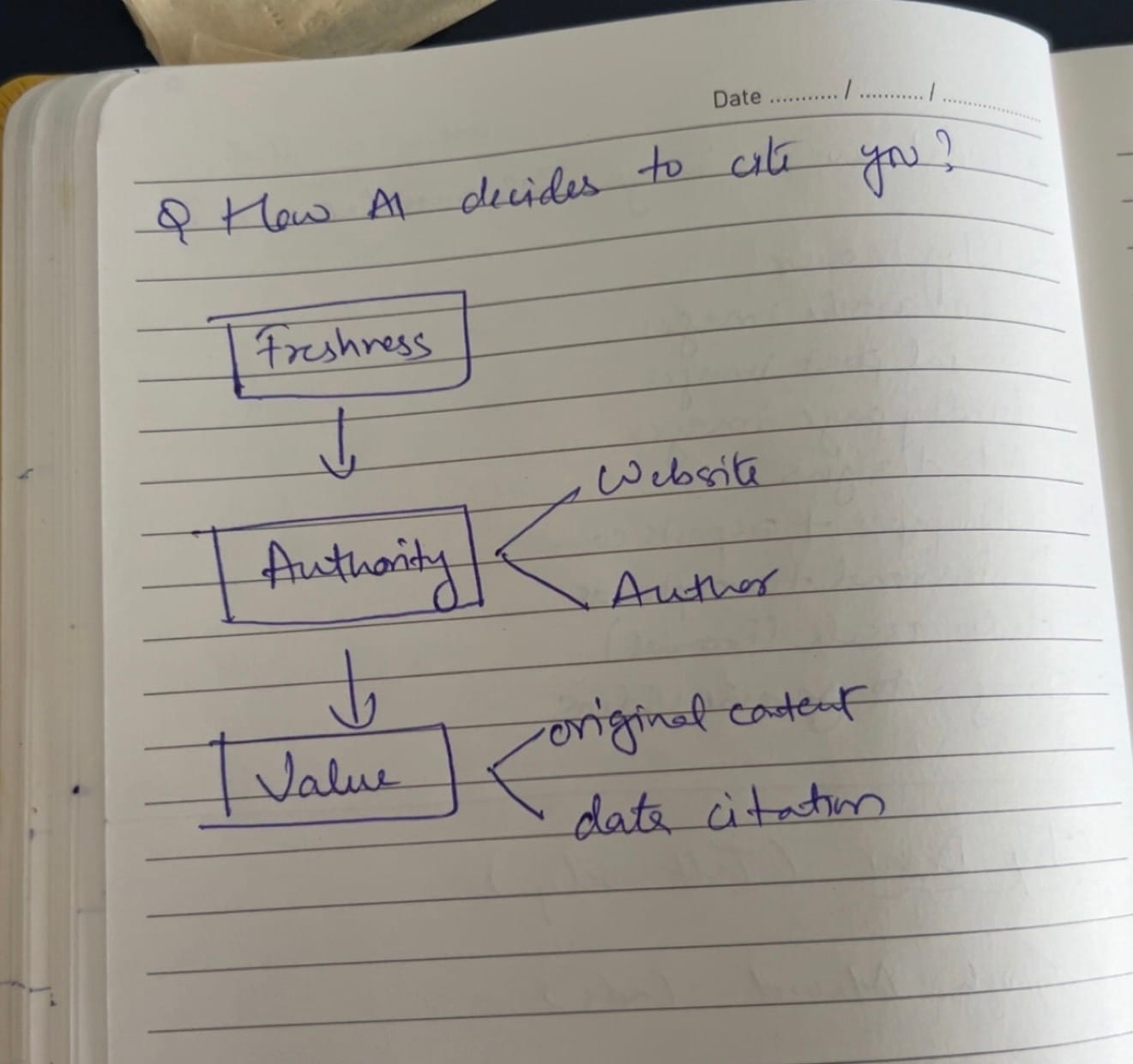
This was the hardest test, as expected. I uploaded a reference image and asked each tool to redraw a specific flowchart, how an AI decides to cite a source, using the reference's exact colors. Two things can go wrong: the text can dissolve, and the tool can ignore the reference entirely and generate something loosely inspired by it.
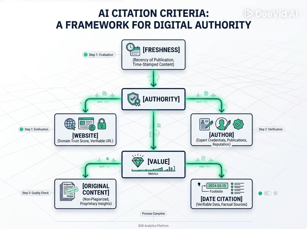
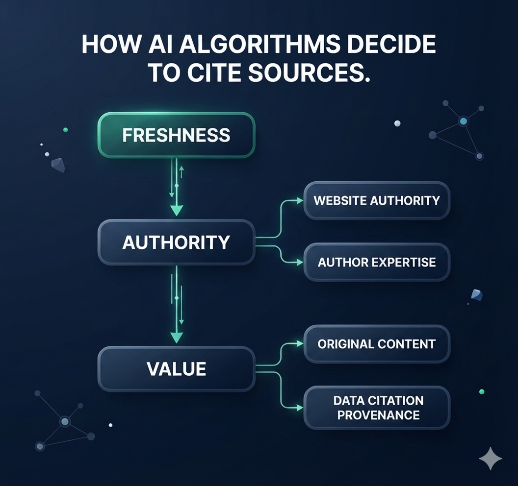
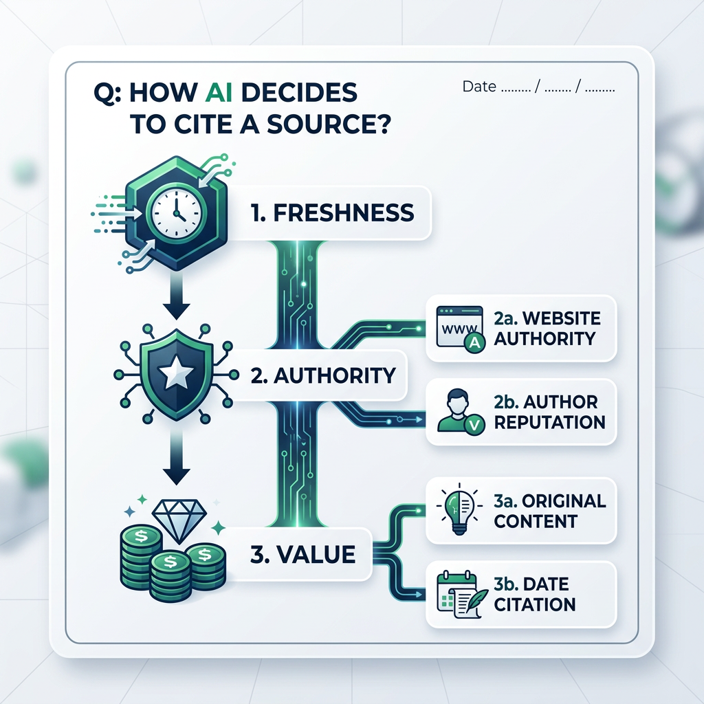
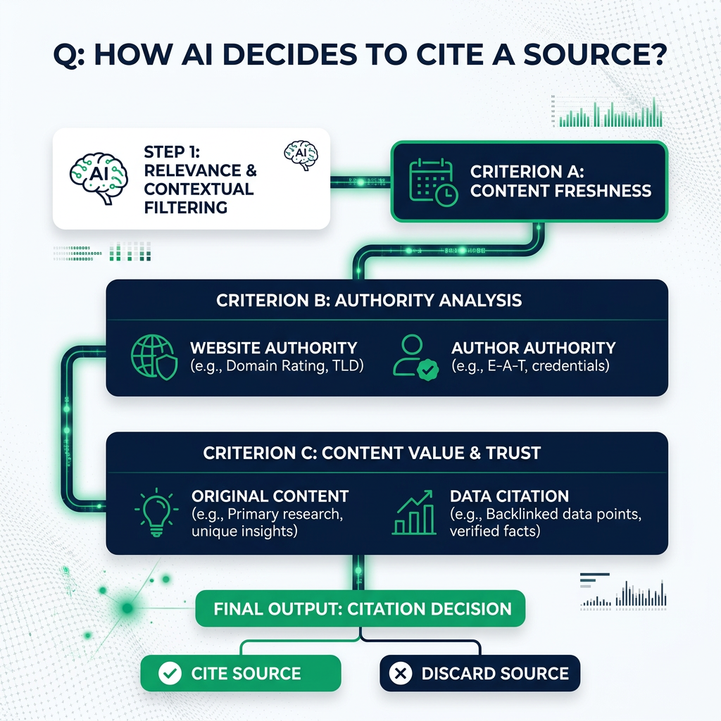
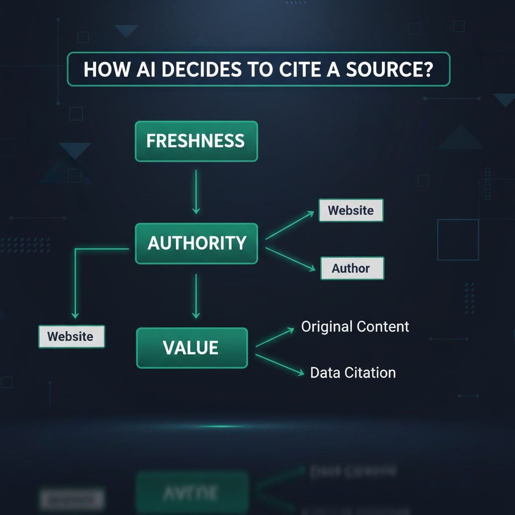
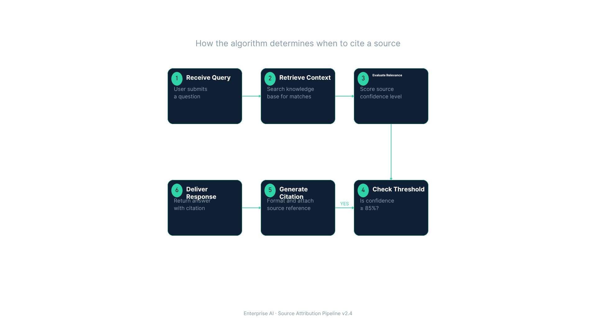
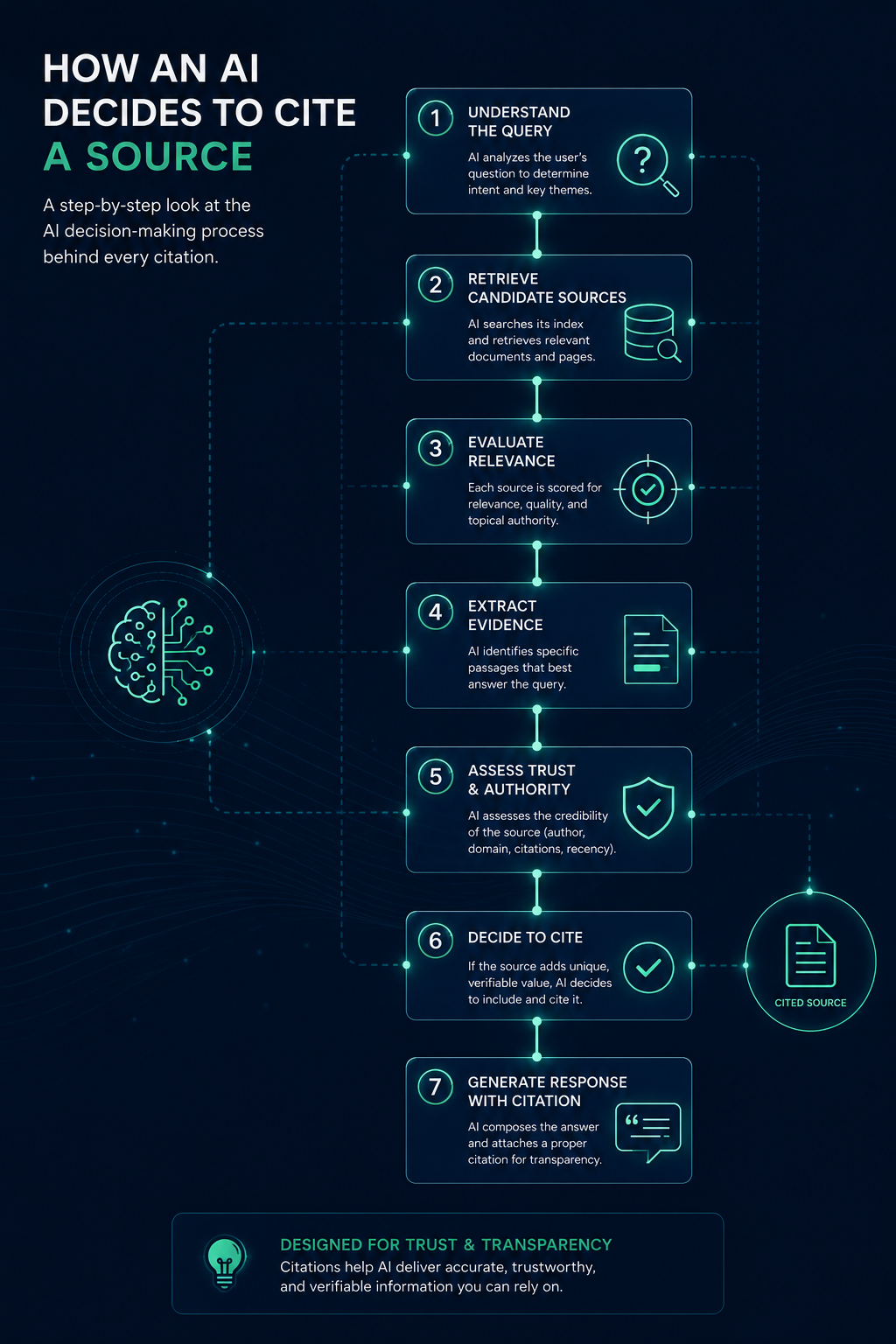
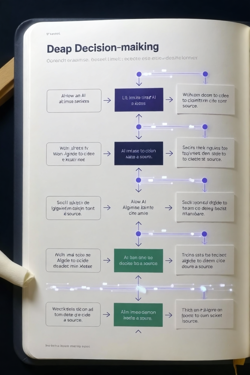
What this test shows: most "image-to-image" is closer to style transfer than reproduction. The tools took our colors and general shape, then improvised the structure. Only a few preserved actual layout and content. If your workflow depends on feeding a tool your real diagram and getting your real diagram back, test that specific behavior before subscribing.
Test 3: The pigeon
"Photorealistic but gently absurd" is a tone instruction, and tone is where models differ most. The prompt also included a deliberate constraint: "no text on the whiteboard."
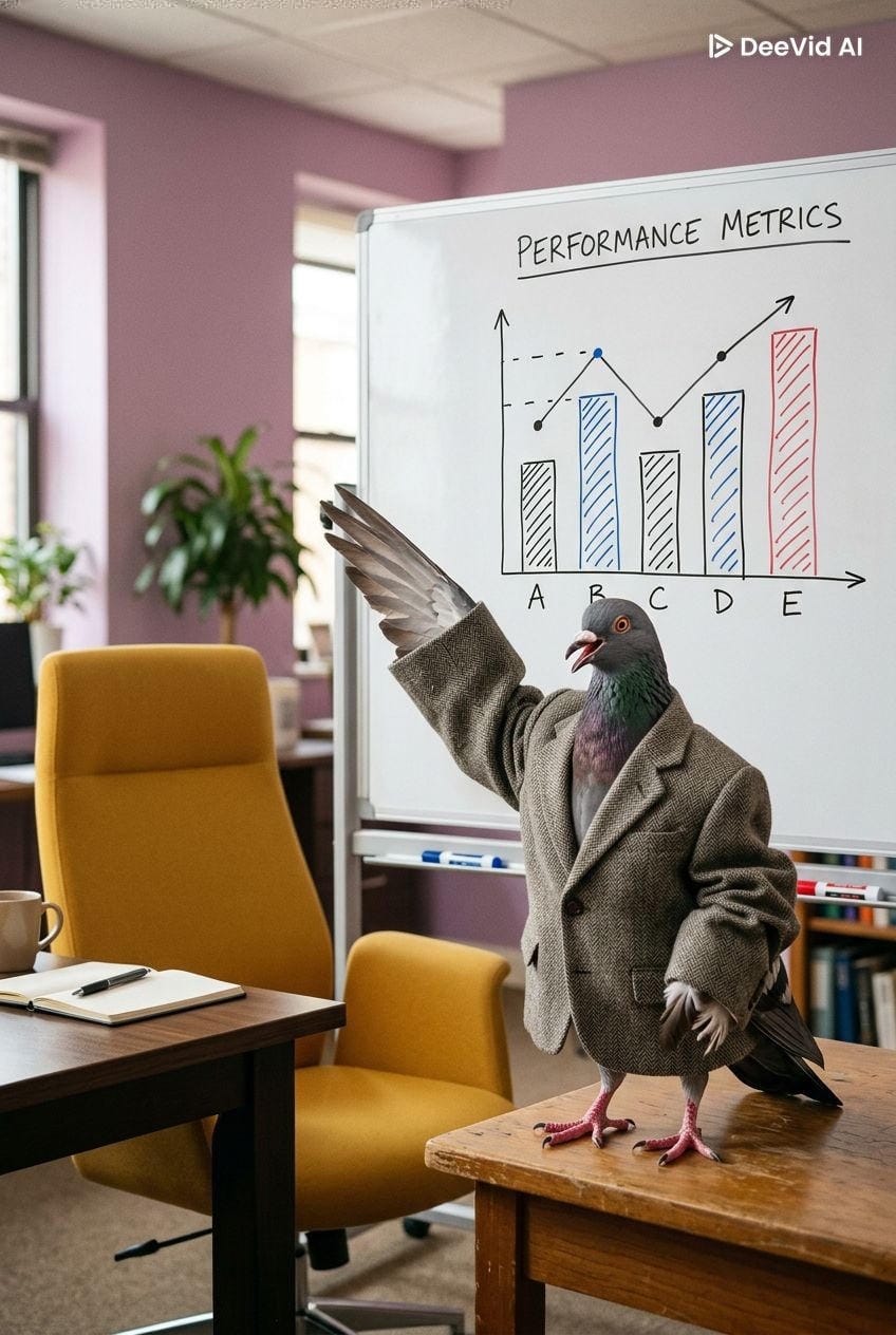
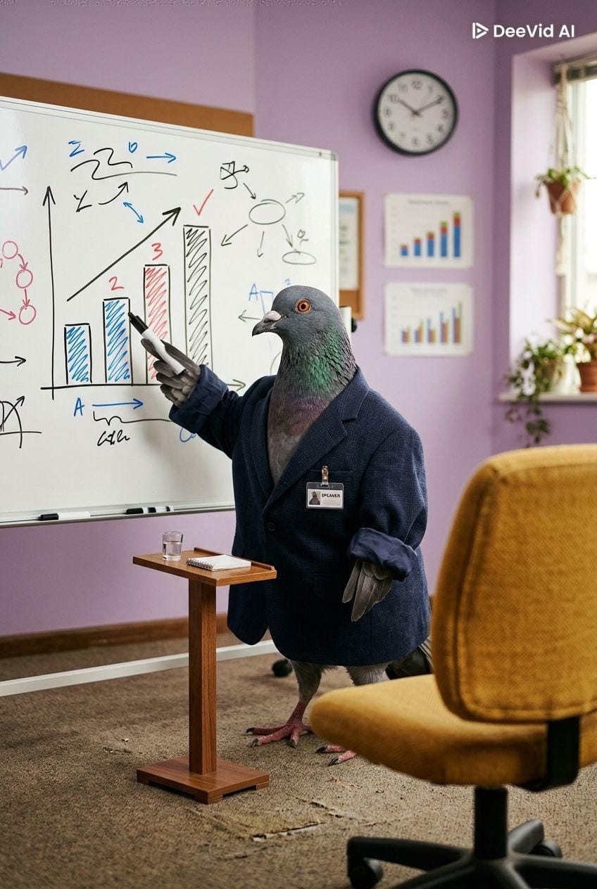

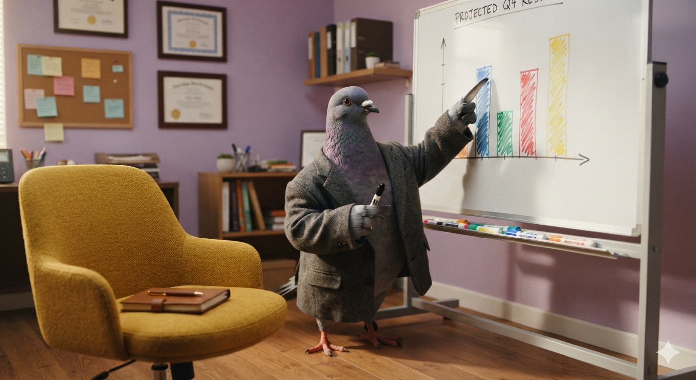
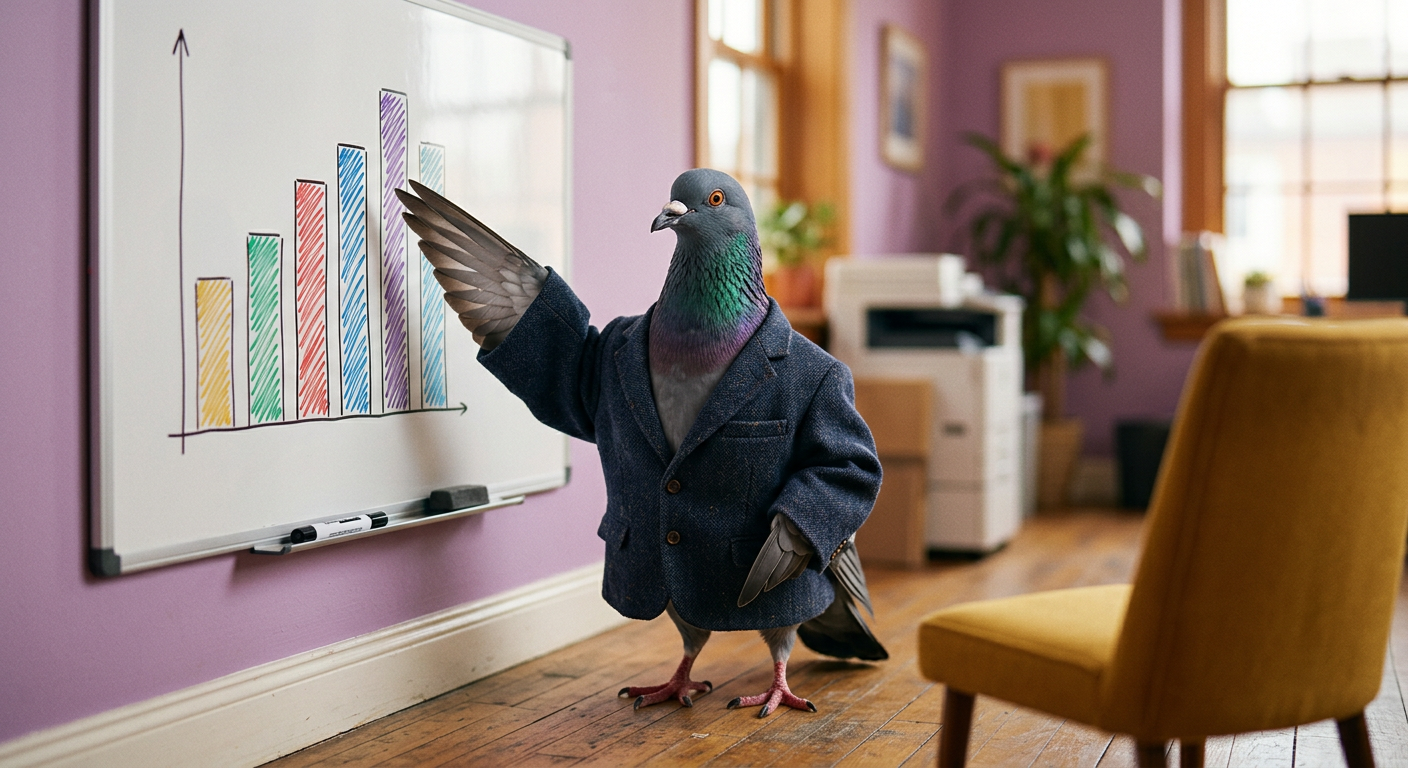

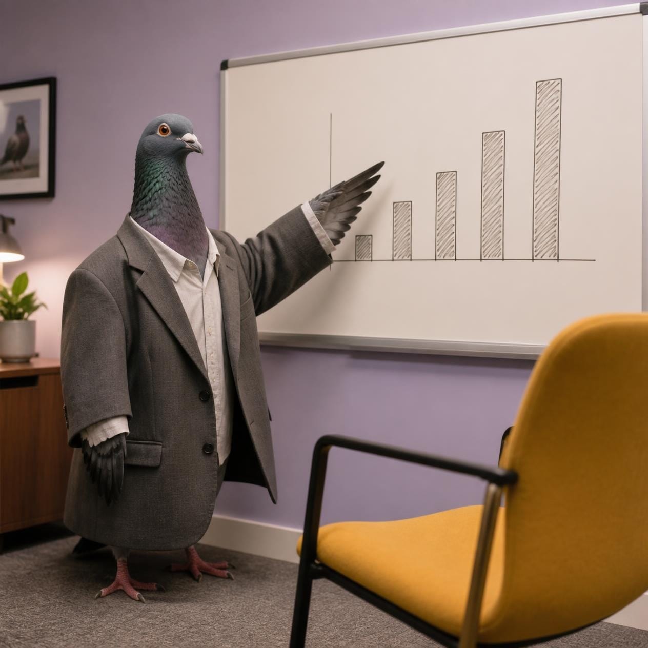

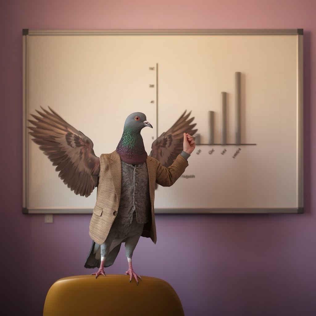
What this test shows: tone is a spec. The tools that handled "gently absurd" correctly (DeeVid, ChatGPT, Gemini) are the same tools that treated prompts as instructions rather than loose inspiration. That correlation held across all three tests.
The 8 AI image generators for B2B marketers
1. DeeVid AI
- Best for: marketers who want one consistent tool instead of a favorite per task
- Model: aggregator routing across frontier models (the Nano Banana family, Flux, and others, plus video models like Sora 2, Veo 3.1, and Kling)
- Free plan: 20 one-time credits on signup, watermarked, no commercial use
- Paid: Lite $10/mo billed yearly ($14 monthly) with 200 credits, Pro $25/mo ($35 monthly) with 600 credits, Premium $119/mo. Commercial license on all paid tiers
- Test total: 64/75, first place
DeeVid is technically a video-first platform, but its image generation outperformed every dedicated image tool in our test. The likely reason is the routing: instead of one house model with one personality, it matches the task to a model that suits it.
The practical effect is what our scores show, no failures across six outputs. Every image was usable or close to it, and it was the only tool that survived the infographic test with real structure intact.
Caveats: the free 20 credits are one-time, not monthly, outputs are watermarked until you pay, and third-party reviews consistently flag the no-refund policy, so test on monthly billing before committing to annual.
Skip it if: you generate two images a month and already pay for ChatGPT, the bundled subscription only makes sense at volume.
2. Google Gemini
- Best for: volume on a budget, and quick photoreal scenes
- Model: Nano Banana 2 (Gemini 3.1 Flash Image) on the free tier, Nano Banana Pro (Gemini 3 Pro Image) heavily capped
- Free plan: roughly 20 images per day in the Gemini app on current caps, with a small daily allowance of Nano Banana Pro. Google adjusts these numbers often
- Paid: Google AI Pro at $19.99/mo raises caps substantially
- Test total: 58/75, second place
Gemini is the value pick. The free daily allowance is the most generous of any tool I tested, and Nano Banana 2 handles photorealism and clean minimal graphics well. Its infographic was one of only three I would use without edits.
The weakness is a glossy artificial quality in photoreal scenes, our mockup was technically correct but read as synthetic. It also ignored the no-text rule on the pigeon test. Caps and model names shift more often here than anywhere else, so check current limits before relying on them.
Skip it if: brand consistency across a series matters, the free tier gives you little control over which model answers.
3. Adobe Firefly
- Best for: teams with legal requirements around AI training data
- Model: Adobe's Firefly image models, trained on Adobe Stock and licensed content
- Free plan: 25 generative credits per month, watermarked, no commercial use
- Paid: Standard $9.99/mo with 2,000 credits, Pro $19.99/mo with 4,000. Standard image generations are unlimited on paid plans, credits go to premium features
- Test total: 53/75, third place
Firefly's differentiator has never been output quality alone. It is commercial safety: the training data is licensed, and Adobe offers IP indemnification at enterprise level.
In our test it was consistently solid: a strong infographic, a correct pigeon, and only one real failure, the low-quality dashboard rendered in the mockup test. If your company already pays for Creative Cloud, you have Firefly credits included in that subscription.
Skip it if: you need the single best-looking image and commercial-safety framing is not a factor for you.
4. ChatGPT (GPT Image)
- Best for: conversational editing and polish, when you can afford retries
- Model: GPT Image 1.5, OpenAI's native autoregressive image model (DALL-E is retired as of May 2026)
- Free plan: roughly 2 to 3 images per rolling 24 hours
- Paid: Plus $20/mo, roughly 50 images per 3-hour window
- Test total: 50/75, fourth place
ChatGPT produces the most detailed, most rendered images of any tool here, and that cuts both ways. Its mockup had the most convincing dashboard sub-text in the whole test. Its infographic was a well-executed answer to a brief I never wrote.
GPT Image 1.5 reasons about content like the language model it is built into, which makes it strong when your prompt is a conversation and unreliable when your prompt is a fixed spec. The free tier's 2 to 3 images a day is the lowest allowance on this list. Our three-prompt test took two days on one account.
Skip it if: you need volume, or you need the tool to follow your layout instead of redesigning it.
5. Recraft
- Best for: flat design, icons, infographics, anything with text and vectors
- Model: Recraft's own V3 model, the only native vector generator in the group
- Free plan: 30 credits per day, but free images are public, owned by Recraft, and not licensed for commercial use
- Paid: from $10/mo billed annually, which unlocks ownership and commercial rights
- Test total: 47/75, fifth place
Recraft is a designer's tool, and it underperformed in the photorealism tests accordingly. Its pigeon was the most uncanny image of the exercise. But its infographic was clean, numbered, and legible, exactly the kind of asset B2B marketers make weekly.
It also added unrequested decorative elements in the mockup test, a recurring pattern: it makes design decisions of its own. One structural warning: free-plan images belong to Recraft, not you. For client work that is disqualifying until you pay.
Skip it if: you need photorealistic people or scenes. This is a vector and design engine, use it as one.
6. Canva AI
- Best for: marketers already working in Canva who need good-enough, fast
- Model: a stack, Dream Lab runs on Leonardo's Phoenix architecture (Canva acquired Leonardo in 2024), Magic Media on Canva's older pipeline
- Free plan: a small allowance of premium AI uses per month, around 20 on current documentation, and Canva changes these numbers often
- Paid: Pro at $15/mo with a shared monthly AI allowance across all Magic Studio features
- Test total: 46/75, sixth place
Canva's generator scored a genuine win on the mockup, clean, simple, shippable, and produced unremarkable results everywhere else. That is the trade: the generation is average, the workflow around it is unmatched.
You generate, drop into a template, apply your brand kit, resize for five platforms, and export without changing tabs. No standalone generator competes with that loop. The catch is that credits are shared across every AI feature in the suite, so image generation competes with your Magic Write usage.
Skip it if: the image itself is the product. Canva is where images get finished, not generated.
7. Leonardo AI
- Best for: stylized marketing layouts and ad-like compositions, with supervision
- Model: Leonardo's own Phoenix and Lucid Origin models, plus third-party model access
- Free plan: 150 tokens per day, but free generations are public
- Paid: from $12/mo, which buys privacy and more tokens
- Test total: 43/75, seventh place
Leonardo understood our mockup brief better than almost anyone. It grasped that B2B marketers want a composed ad, not just a scene, and delivered a headline, subcopy, and icon row unprompted.
It also delivered an unprompted fake logo, and in the pigeon test, a human hand on a bird. Strong instincts, low prompt discipline: it regularly adds elements you did not request. The daily free tokens are generous and the tool rewards iteration.
Skip it if: you need strict prompt adherence.
8. Krea
- Best for: live visual brainstorming, not finished B2B assets
- Model: Krea's own Krea 2 model plus a large aggregated catalog (Flux and others)
- Free plan: 100 compute units per day, refreshing daily, no commercial license
- Paid: Basic $9/mo with 5,000 units and commercial rights
- Test total: 31/75, eighth place
Krea finished last, and part of that is methodology: our one-shot rules work against a tool built around real-time iteration. Its core feature is the live canvas, sketch, adjust, regenerate in milliseconds, converge on the image.
Judged on first attempts, you get broken mockups, an infographic full of dummy text and wrong spellings, and a pigeon scene with an added dog. Judged as a sketching tool for exploring concepts before briefing a real generation elsewhere, it works. Those are different jobs.
Skip it if: you need first-shot accuracy or any text in your images at all.
The free tier reality check
Every tool here has a "free plan." They are not the same kind of free.
How to run this test yourself
- Write 3 prompts from your actual backlog, real assets you need this month, not hypotheticals.
- Use the five-part anatomy: subject, style, composition, color, constraint.
- One generation per tool per prompt. First result counts. Retries are the paid-plan experience, and you are evaluating the free one.
- Score on the five criteria in our rubric, out of 25.
- Screenshot everything immediately, including watermarks and the interface. The credit counter is data too.
- Total the scores, then look at the per-test winners rather than the total. That is your actual stack.
FAQ
Q: Which AI image generator is best for B2B marketing in 2026?
In our tested comparison, DeeVid scored highest overall (64/75) for consistency across mockups, infographics, and creative prompts. But the best tool depends on the task: Gemini for volume, Recraft for flat design, Firefly for commercially safe enterprise work.
Q: Can AI image generators render readable text now?
Headline text, mostly yes. Small text, still no. Every tool in our test produced garbled labels somewhere. Generate images clean and add text in Canva or Figma.
Q: Are free plans enough to evaluate these tools?
Yes, that is what they are for. Our whole test ran on free tiers. Know the catches: some free plans give no commercial rights (DeeVid, Recraft, Firefly, Krea) and some make your images public (Recraft, Leonardo).
Q: What is the biggest mistake marketers make with AI image tools?
Vague prompts. The gap between a vague prompt and a specified one is bigger than the gap between the best and worst tools. Name the subject, style, composition, colors, and constraints, every time.
Q: Do these tools work for image-to-image generation from a reference?
Partially. Most tools take your reference's colors and mood, then invent their own structure. If you need your exact diagram redrawn, test that specific workflow. In our test, only a few tools preserved real structure.

About the author
Rashmita co-founded LymLyt, a B2B SaaS content agency, after 8 years in adtech and martech content. She loves testing AI tools that help her with content marketing. She writes about content, SEO, and marketing workflows at lymlyt.pro.