
How to Create Y2K Style Arts (Images & Videos) with DeeVid AI
TL;DR
Y2K style blends neon gradients, chrome/gloss, bubbly 3D shapes, rounded fonts, UI motifs, and VHS/CRT vibes. Use DeeVid AI’s Text-to-Image, Image-to-Image, Video Generator to create it fast.
What is Y2K Style and What “Y2K” Looks Like?
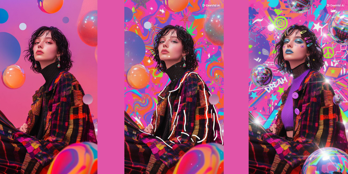
“Y2K” is a late-1990s/early-2000s retro-futurist look rooted in early internet culture and dot-com tech. Visually, it mixes bright neon gradients, metallic/chrome surfaces, translucent plastics, rounded/‘bubbly’ UI, and simple 3D forms—optimistic, glossy, and a little sci-fi.
Core visual traits :
- Color & light: hot pinks, lime, electric blue; vivid magenta→cyan gradients; high-gloss highlights/bloom.
- Materials: chrome/liquid-metal, holographic/iridescent effects, clear/translucent plastic (think iMac G3 era).
- Forms & layout: soft, blobby 3D shapes, beveled buttons, pill-shaped UI, asymmetry that still feels playful.
- Type: rounded, chunky display fonts, techno/cyber styles, chrome lettering.
- Motion finish: subtle CRT/scanlines, tiny RGB split, and a hint of VHS grain—used lightly so it reads “early-2000s display,” not damaged tape.
Where Y2K Came from (and Why "2k" reads “2000”)
The look reflects millennial-era techno-optimism and consumer tech design: translucent, candy-colored gadgets, glossy UI, and CG ‘liquid metal’ experiments that felt futuristic at the time. Media touchstones span early web interfaces, music videos, and gaming/CG graphics; interiors/fashion added metallics, plastics, platform silhouettes, and maximalist accessories.
Start to Create Y2K Arts with DeeVid AI
Before start, make sure you've already had a DeeVid AI Account. If not, you can set up one now and we offer new comers 20 free credits to try all possibilities.
Workflow 1 — Text-to-Image
Best for: brand-free portraits/half-body fashion shots for your phone wallpaper, prints, profile images, and sticker sheets.
Step-by-step
- Canvas & ratio: Wallpaper: 9:16 (portrait); Poster/print: 3:4 or 4:5; PFP: 1:1 (center the face).
- Copy-paste prompts (choose one)
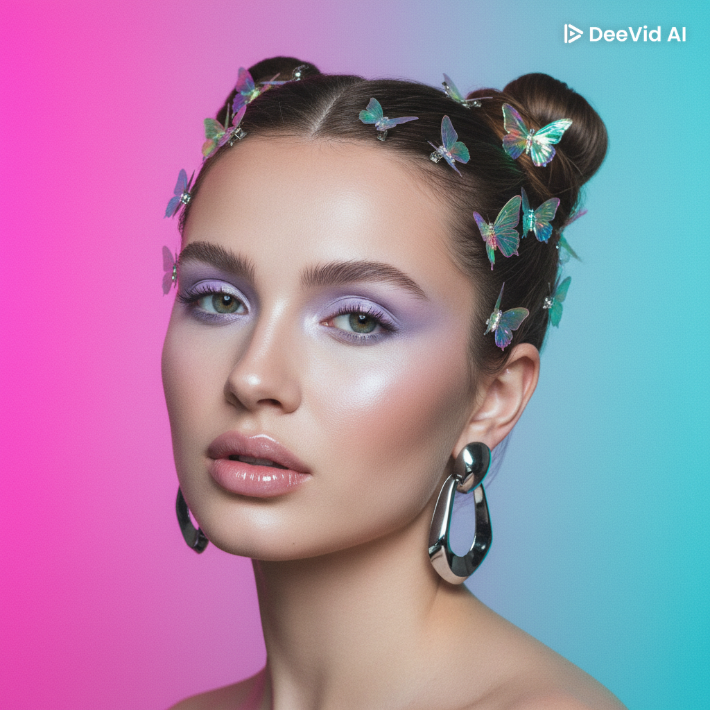
Glossy Lilac Beauty (poster / wallpaper):
a beautiful adult woman in her 20s, Y2K beauty look, glossy lips, lilac pastel eyeshadow, soft highlight,
butterfly hair clips, space-bun hairstyle, thin soft brows, clean studio light, neon magenta→cyan gradient backdrop,
chrome accents in earrings, soft bloom, retro-futurist early-2000s vibe, editorial portrait, high detail
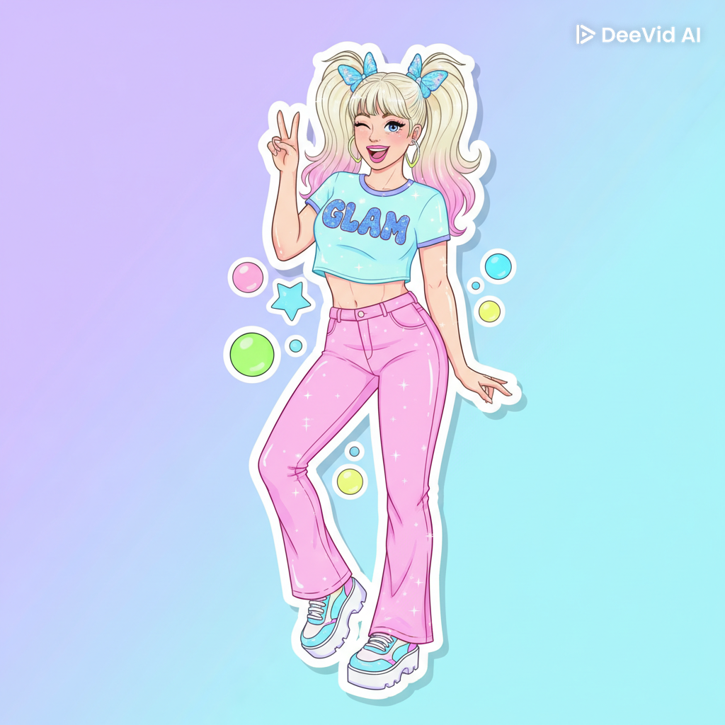
Blue Frost & Chrome (wallpaper):
adult woman portrait in Y2K sticker style, holographic sparkles, rounded bubbly accents,
pastel-neon palette, clean white sticker borders, cute playful fashion pose, glossy finish
3.Style boosters: Add “polished chrome,” “holographic sheen,” “studio reflections,” and “rounded/chunky typography.” (Rounded + vibrant gradients are signature Y2K.)
4.Generate 4–8 variations; shortlist 1–2 with the best chrome highlights and gradient pop.
5.Quick finals: Use DeeVid’s image editor function (on the same workflow) to remove distractions, upscale for glossy edges, and add light bloom.
Troubleshooting
- Chrome looks dull? Mention polished, reflective, high-gloss chrome; include a bright gradient so reflections read clearly. Designers note chrome pops against vibrant backgrounds.
- Not “Y2K” enough? Reinforce rounded fonts, bubbly bevels, UI pill buttons, neon gradients.
Extra Ready-Made Prompts
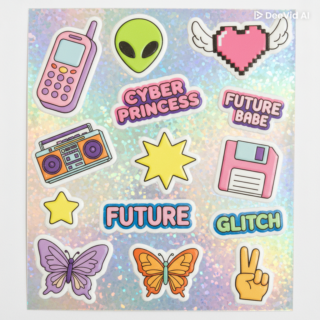
- Sticker Sheet (for messaging apps & zines)
Y2K sticker pack, holographic film effect, sparkles, rounded icons, bubbly bevels,pastel-neon palette, clean white border stickers on a sheet
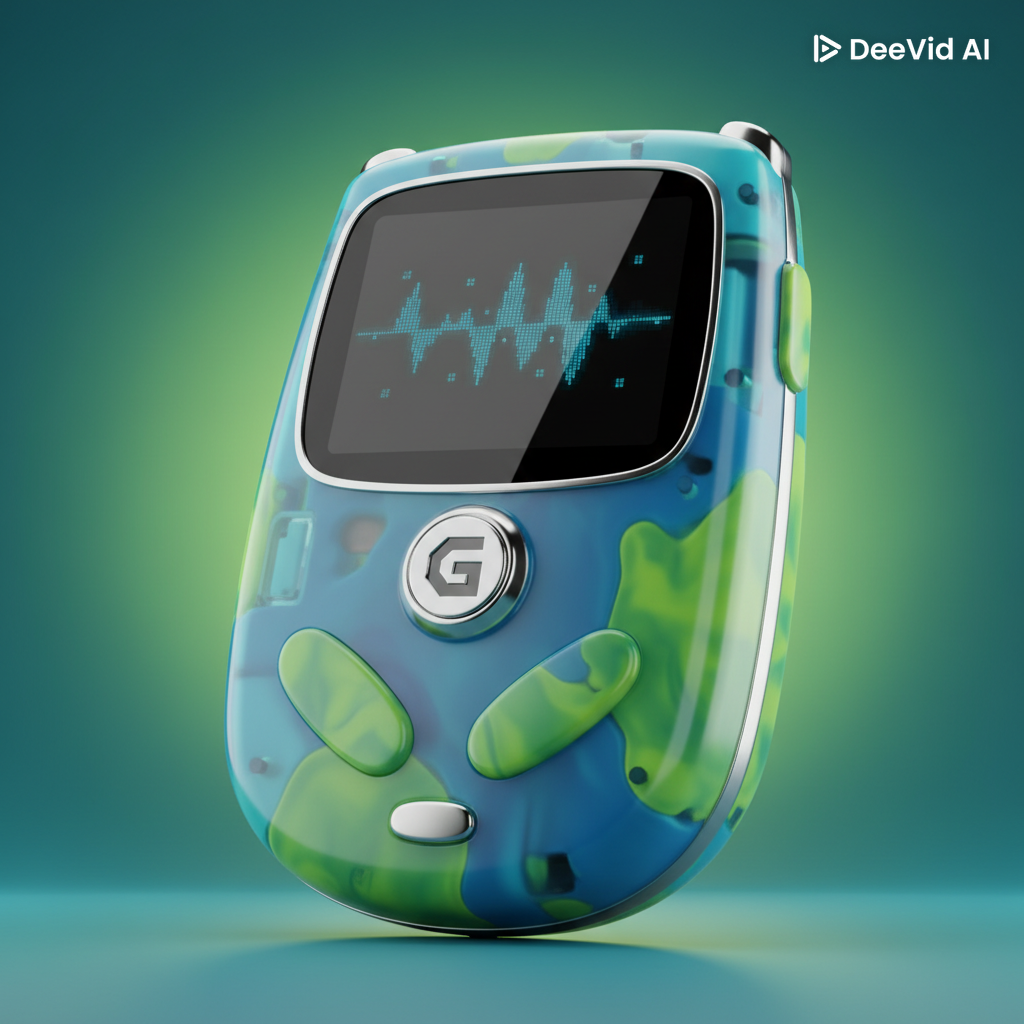
- “Translucent Tech” Poster (bedroom print)
translucent plastic handheld gadget in Bondi-blue/limed colors, rounded edges, chrome trim,
gradient backdrop, early-2000s tech aesthetic, studio render
Workflow 2 — Image-to-Image
Best for: turning a selfie into glossy poster art, converting a simple doodle into chrome art, or re-coloring a hobby logo for your room/phone.
Steps
- Upload a base image (selfie, pet photo, sketch, or hobby mark).
- Prompt: Turn this image into a Y2K Style.
- Tune
- If the face warps: lower transform strength.
- Not “Y2K enough”? Reinforce glossy lips, pastel eyeshadow, butterfly clips/liner, thin soft brows.
4.Finish
- Upscale, add a gentle edge-glow to chrome accessories; keep skin clean and luminous.
Selfie makeover tip: Add “soft bloom highlights, holographic sparkle accents” and keep facial features intact with lower transform strength.
Workflow 3 — Image-to-Video
Best for: Stories/Reels/TikTok loops, animated lock screens, intro cards.
Steps
- Start from your favorite still (T2I or I2I result).
- Duration: 5/8 s for an easy loop.
Export
- Vertical 9:16 for social; keep effects tasteful and avoid heavy VHS noise to preserve the glossy Y2K finish.
Y2K Arts Prompt Library (quick copy-paste)
- Y2K beauty portrait of a woman with glossy lips, lilac pastel eyeshadow, butterfly hair clips, thin soft brows, chrome earrings, neon magenta→cyan gradient backdrop, soft bloom, clean editorial lighting.
- Close-up fashion headshot with frosted blue eyeshadow, juicy lip gloss, butterfly-style eyeliner with tiny rhinestones, neon violet→aqua gradient, high detail, studio light.
- Portrait with space buns and pastel butterfly clips, glossy lips, soft lilac wash on lids, chrome hair pin, neon cyan→pink gradient background, centered composition, subtle glow.
- Beauty shot with polished chrome hoop earrings, liquid-metal cheek highlight, pastel eyeshadow, softly thinned brows, neon pink→teal gradient, crisp speculars.
- Sticker-sheet style portrait with rhinestone wing along the lashline, glossy lips, pastel lilac shimmer, holographic sparkles, rounded white sticker border, pastel-neon palette.
- Night-out “club glow” portrait with blue-lilac smoked shimmer, high-shine gloss, chrome barrette, gentle lens flare, bold neon gradient background, clean highlights.
- Half-body banner portrait with translucent plastic hair accessories, pastel eyeliner, chrome pendant, hot-pink→lime gradient wash, soft bloom, early-2000s retro-future vibe.
- Pop-princess headshot with softly thinned brows, glossy pink lips, lilac inner-corner highlight, butterfly clip accent, neon magenta→cyan background, tidy framing.
Quick Set Up Y2K Color & Beauty
Makeup staples that scream Y2K (and photograph beautifully):
- Frosted lids (icy blue, lilac, silver) + high-shine lip gloss.
- Lilac/purple accents (shadow, inner-corner highlight, highlighter) — a headline Y2K comeback.
- Thin/soft brows to nod to era styling (don’t overdo).
- Butterfly details (clips or liner) and face gems/rhinestones for sparkle.
Backgrounds & materials (set the scene):
- Neon gradients (magenta→cyan, violet→aqua, hot-pink→lime) behind faces make chrome and frosted tones pop.
- Chrome accents (earrings, barrettes, chokers) + translucent plastic hair pieces = instant retro-future.
Finishing for short loops (I2V):
- Add very light CRT/scanlines and a tiny chromatic-aberration edge; keep noise minimal so the look stays glossy, not “damaged VHS.”
FAQ: Y2K Style with DeeVid AI
1) What visual traits instantly signal “Y2K”?
Bright neon gradients, metallic/chrome finishes, translucent plastics, rounded/bubbly fonts, chunky 3D, glossy UI pills, and light CRT/VHS textures. These were common across late-90s/early-2000s tech and graphic design.
2) What color palettes work best?
Start with magenta↔cyan, electric blue↔lime, or hot-pink/orange gradients, then add crisp whites and chrome. Gradients and metallics are a core Y2K cue; use one hero gradient and one metallic focal element.
4) How do I prompt DeeVid AI for reliable chrome?
Use phrases like: “chrome 3D,” “polished, beveled, reflective,” “studio highlights,” “liquid-metal”. Add “glossy reflections, iridescent edges” and ensure your scene includes a bright gradient to reflect in the metal. (Design tutorials consistently show chrome reads best with strong highlights/reflections.)
5) My chrome looks flat. What should I tweak?
Increase highlight contrast, add “studio reflections / HDRI-like lighting” terms to the prompt, and avoid matte backdrops. Try Image-to-Image with a chrome reference to “teach” reflectivity.
6) How much CRT/VHS texture is “right”?
Keep overlays subtle: very light scanlines, a touch of grain, and tiny chromatic aberration. Y2K is glossy-optimistic—not heavy horror-VHS. Motion tutorials show that thin scanlines + mild RGB split feel authentic without crushing clarity.
7) What’s a good starting prompt for a Y2K text logo?
“chrome 3D wordmark, beveled edges, iridescent highlights, reflective, floating over neon magenta→cyan gradient, rounded display type, soft bloom.” (Rounded/bubbly fonts + chrome + gradient is a proven combo in Y2K logo design.)
8) How do I animate a static Y2K poster?
Use Image-to-Video with small, layered motions: parallax, specular glints on chrome, gradient shimmer, and UI bubbles drifting. Over-motion can smear chrome; subtlety sells realism.
9) What are the most common mistakes when making Y2K Style Arts?
- Over-texturing CRT/VHS (go light).
- Too many “hero” effects in one frame.
- Flat chrome (fix with stronger highlights/reflections).
- Illegible type (use bold rounded display fonts).
10) Can Y2K include grunge/punk textures?
There’s a parallel strand that mixes grunge/graffiti with Y2K shine. If you go this route, keep chrome/gradients present so it still reads “2000s” vs pure 90s grunge.